Gaia/Design/BuildingBlocks: Difference between revisions
Jump to navigation
Jump to search
No edit summary |
|||
| Line 9: | Line 9: | ||
** Icon only | ** Icon only | ||
** Text only | ** Text only | ||
* States: | |||
** normal | |||
** Active (pressed) | |||
== Dialogue: Prompt == | == Dialogue: Prompt == | ||
Revision as of 09:41, 19 June 2012
Buttons
Characteristics:
- Have two components: visual target and hit target.
- Later is always larger. Has minimum sizes.
- Types:
- Icon + text
- Icon only
- Text only
- States:
- normal
- Active (pressed)
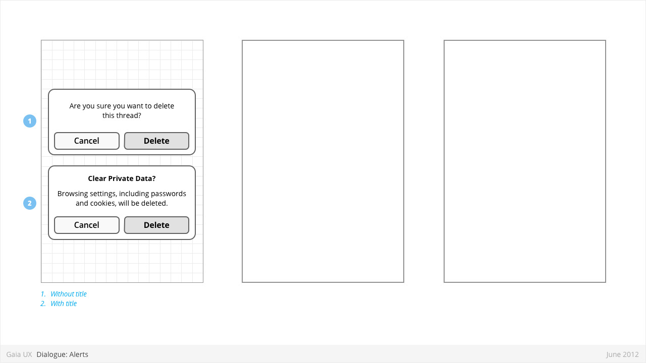
Dialogue: Prompt
Used for:
- Alerting users to important events, notifications, etc.
Characteristics:
- Modal: occupies the screen and requires user input to clear.
- Consist of
- Title
- Body (optional)
- Dismissal button (eg: “Cancel”)
- Confirmation button (eg: “Delete”)
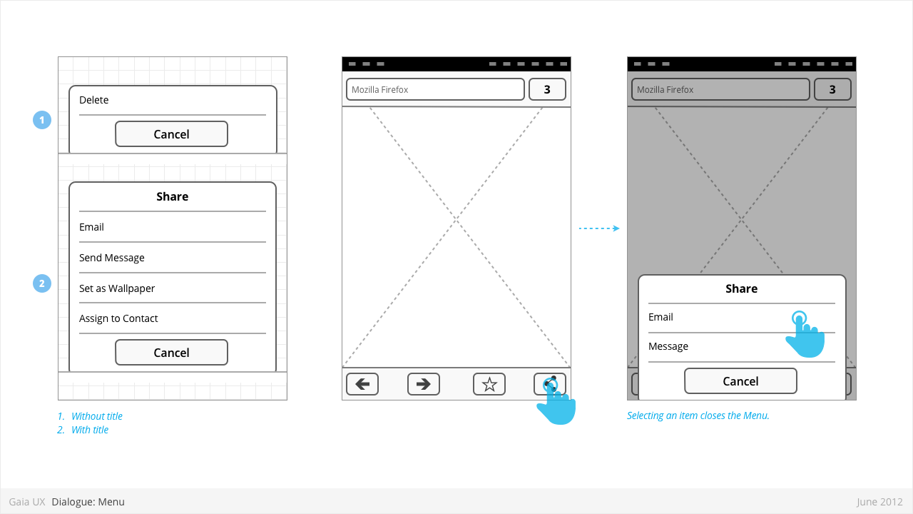
Dialogue: Action Menu
Used for:
- Presenting a list of items, usually actions or links (eg: Edit, Delete, etc).
Characteristics:
- Menus are spawned from buttons, often positioned within Toolbars.
- Present 1 or more items.
- Vary in height, to a maximum of Keyboard component height.
- Titles are optional.
- Are closed by:
- Selecting one of the items
- Pressing "Cancel" button (wording may be different)
- Pressing “OK” button, if available (label may be different)
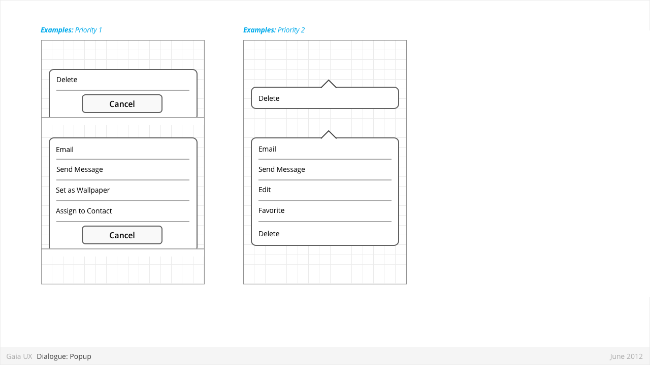
Dialogue: Object Menu
Used for:
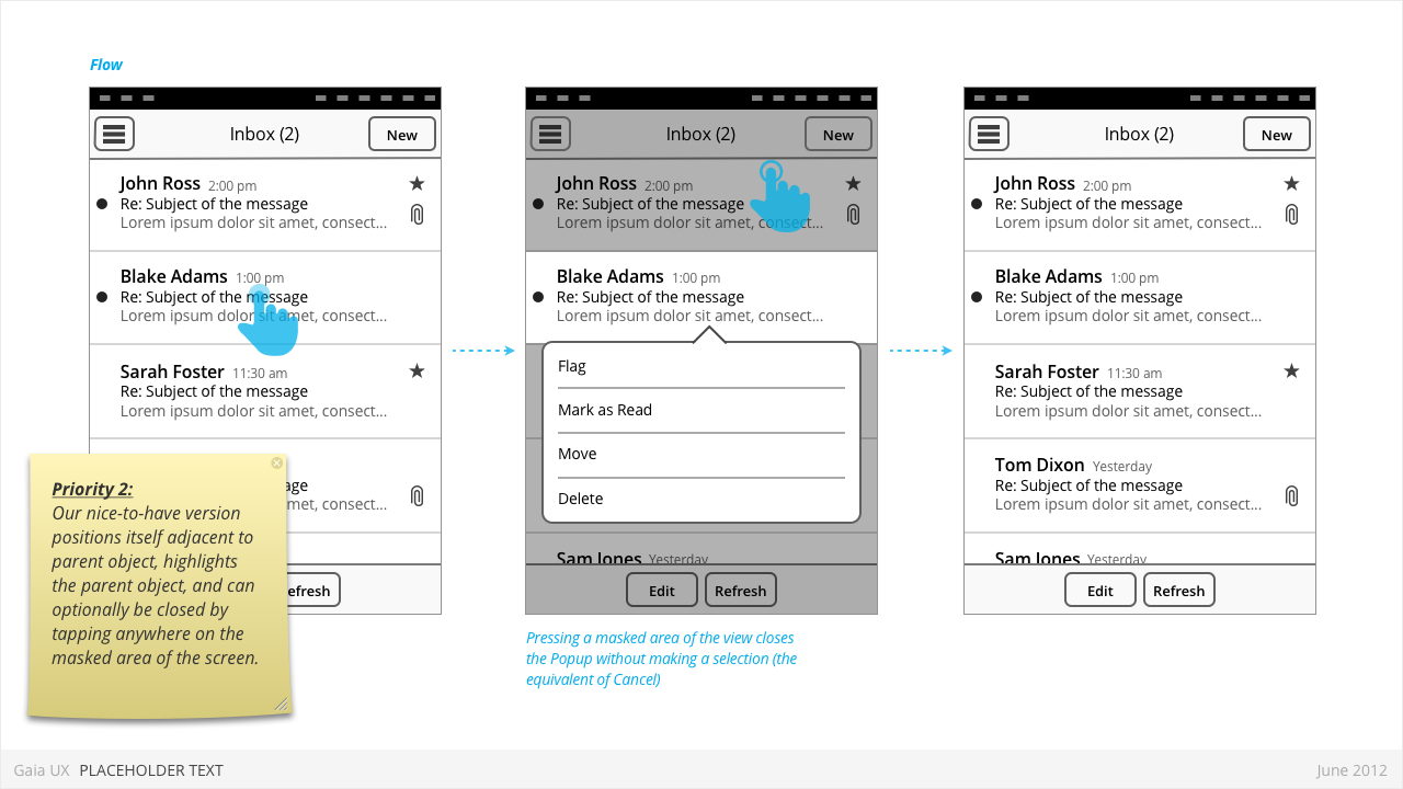
- Enabling optional shortcuts to contextual actions that might otherwise require stepping one level deeper into the hierarchy. For example, deleting a photo via it's thumbnail, instead of having to open the full image.
Characteristics:
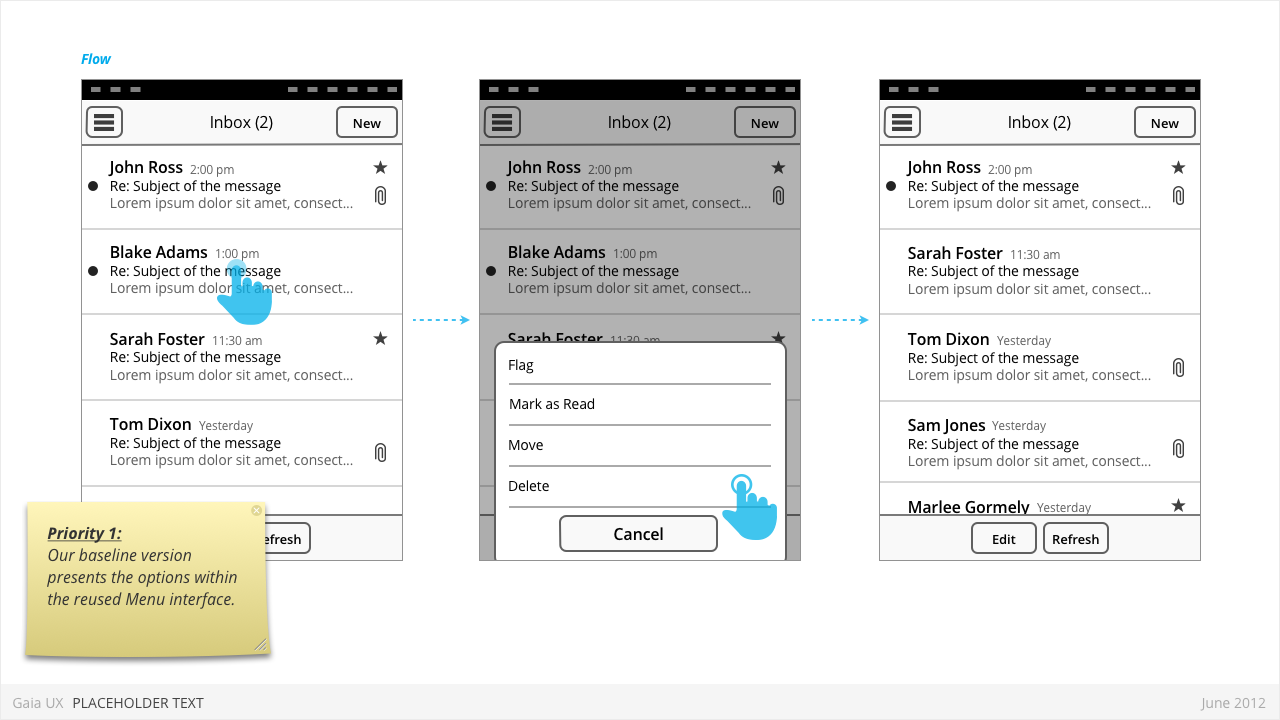
- User presses-and-holds a selectable item (can be a list row, a phone number, a browser link, etc)
- Menu displaying one of more options pops up after X seconds.
- Priority 1:
- Reused the Menu pattern interface to present the options.
- Priority 2:
- Menu positions itself immediately above or below the parent object (depending on the amount of available screen space)
- The parent object element is visually highlighted (e.g.: darken surrounding content, or draw border, etc)
- User can press anywhere else on screen to change the focus and close the popup.
Dialogue: Value Selector
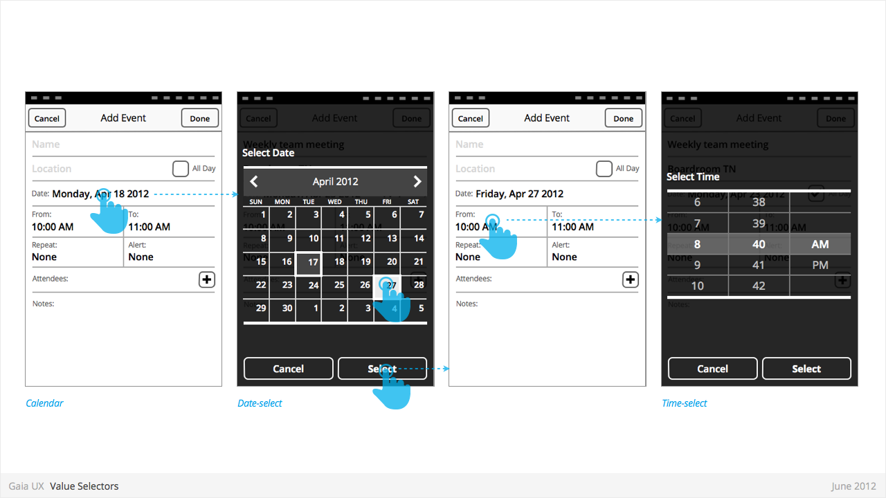
Used for:
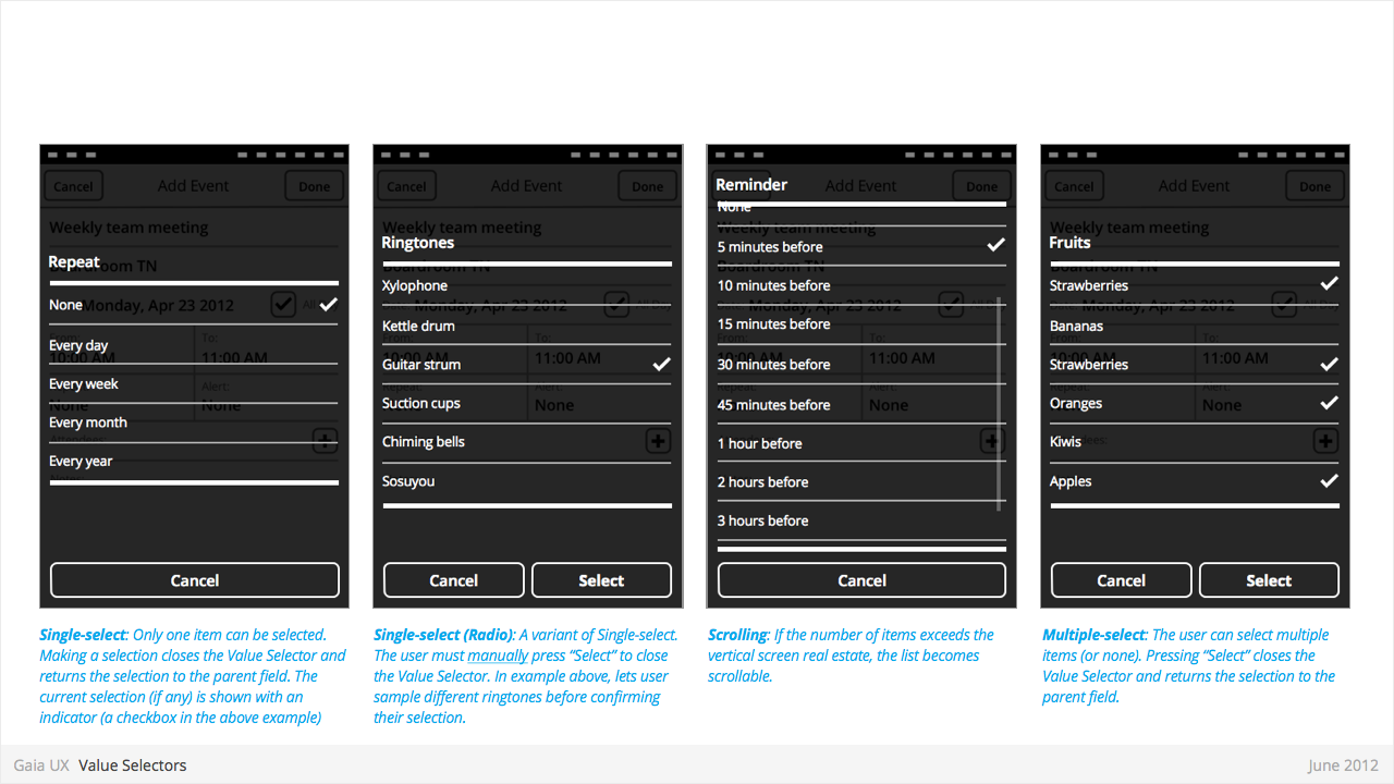
- Provides a way for the user to select one of more values.
- Most commonly associated with forms, but also used elsewhere.
- Interface conventions are flexible, and new Types can be added to the list below.
Characteristics:
- Types:
- Date
- Time
- Single-select list
- Multiple-select list
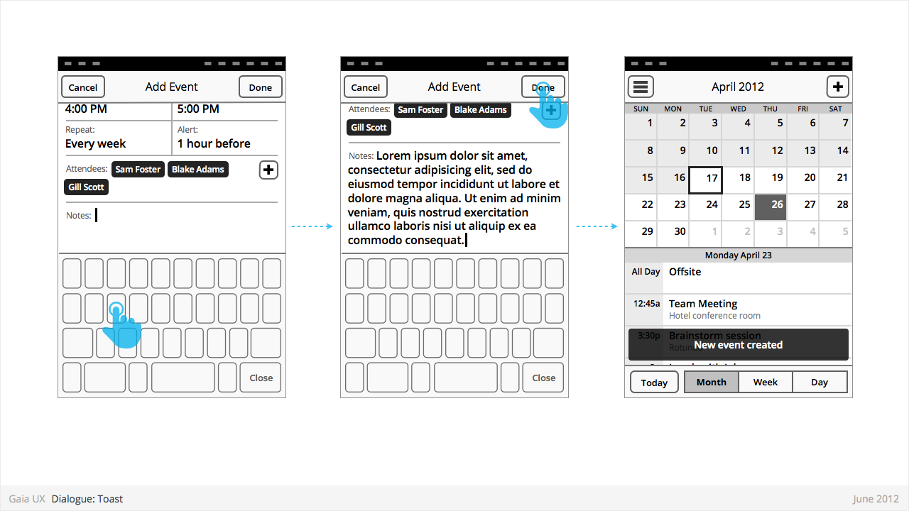
Dialogue: Banner
Used for:
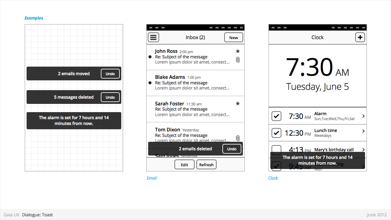
- Banners confirm a user action, and optionally provide a follow up action (eg: Undo).
Characteristics:
- Typically appear after a multi-select edit. eg:
- Deleting multiple photos from (Gallery)
- Deleting multiple emails (Email)
- Moving multiple emails (Email)
- Toasts are positioned at the bottom of—and layered on top of—their associated content view.
- Toasts should be non-intrusive, and never cover up other UI elements (eg: toolbar, tabs, etc).
- Optionally provide opportunity to take related secondary action via button (eg: Undo).
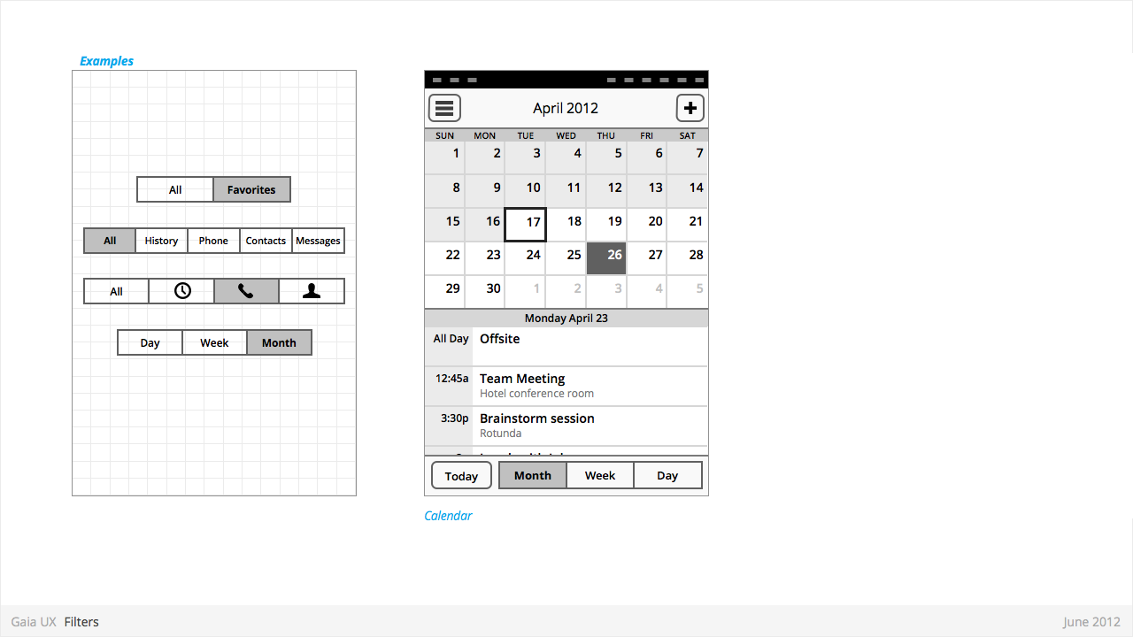
Filters
Used for:
- Secondary Navigation
- Filters can provide a second set of tabs, where tabs are already present.
- Data Filter
- Filters can be used to enable the user to view a single set of data in a different lens.
- eg: in Calendar, the filters they allow user to view time in different scales, from Day to Month).
Characteristics:
- Horizontal sequence of buttons.
- Only one button is Focused at a time.
- Best practice is to place filters within Toolbars, so they do not flow with the content.
- Left, Middle and Right buttons can be styled uniquely.
- Width: variable, depending on number of filters required within a single set (see Numbering). Should establish a maximum width, however.
- Numbering: minimum 2, maximum 5.
- Can be populated with icons or text, but not both. Because of the smaller height of a filter (versus a tab), text is the best practice.
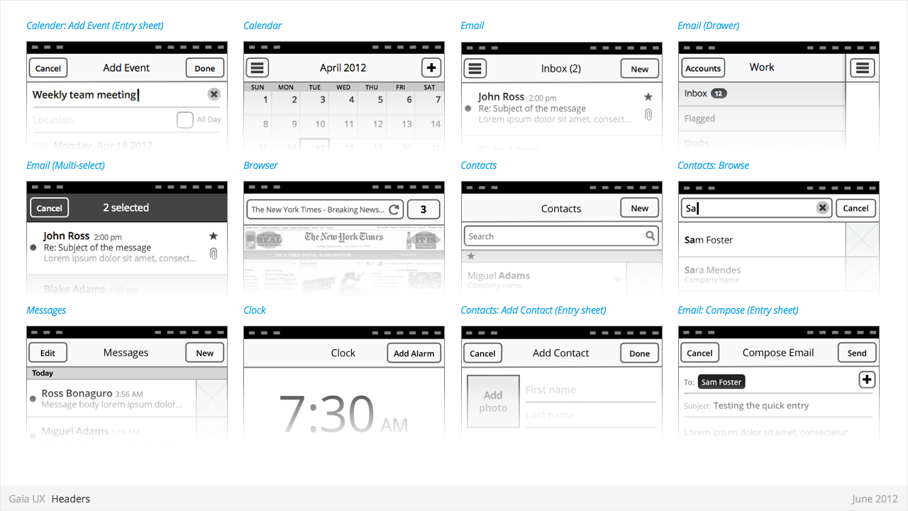
Headers
Used for:
- Labeling the active view.
- Providing top-level navigation and inputs for the active view.
Characteristics:
- Horizontal full width bar that appears at top of screen in most apps
- Floats above content, with option to flow with content in some rare cases (eg: Browser).
- Heading text provides name of current view.
- Optional: heading text string can include text (eg: current unread email count)
- Present in most applications
Lists
Used for:
- ...
Characteristics:
- Varying heights (1—3 rows)
- Varying contents (from text only to image + text + button)
- Are composed of rows, and section headers
- Types:
- Action row (click anywhere to trigger input)
- Status indicator row
- Button row
- Link row
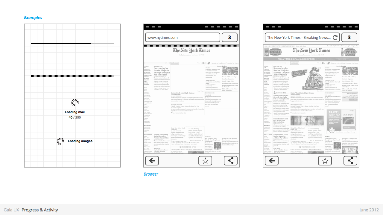
Progress & Activity Indicators
Used for:
- Providing user with visual feedback that a process is active.
Characteristics:
- May include an animated visual element, a text label, or some combination of the two.
- Types:
- Progress
- Displays a loading animation that goes from 0 to 100 percent, communicating the current process status.
- Activity
- Displays a looping animation, communicating to the user that the process is active.
- Progress
Scrolling
Used for:
- ...
Characteristics:
- Types:
- Scrollbar
- Index scrolling
Seek Bars
Used for:
- ...
Characteristics:
- Consists of track and knob (button w/ normal and pressed states)
- Optional images for left and right values
- Can be horizontal or vertical
Switches
Used for:
- ...
Characteristics:
- Presents two mutually exclusive choices or states (used in table views only).
- Types:
- On/Off toggle
- Radio
- Checkbox
Tabs
Used for:
- ...
Characteristics:
- Fill the full horizontal width.
- Number between 3—5.
- Positioned at bottom of screen.
- Can contain various elements (buttons, filters, indicators, etc).
- Versions:
- Text + icon
- Icon-only
States:
- Normal
- Focused
- Disabled
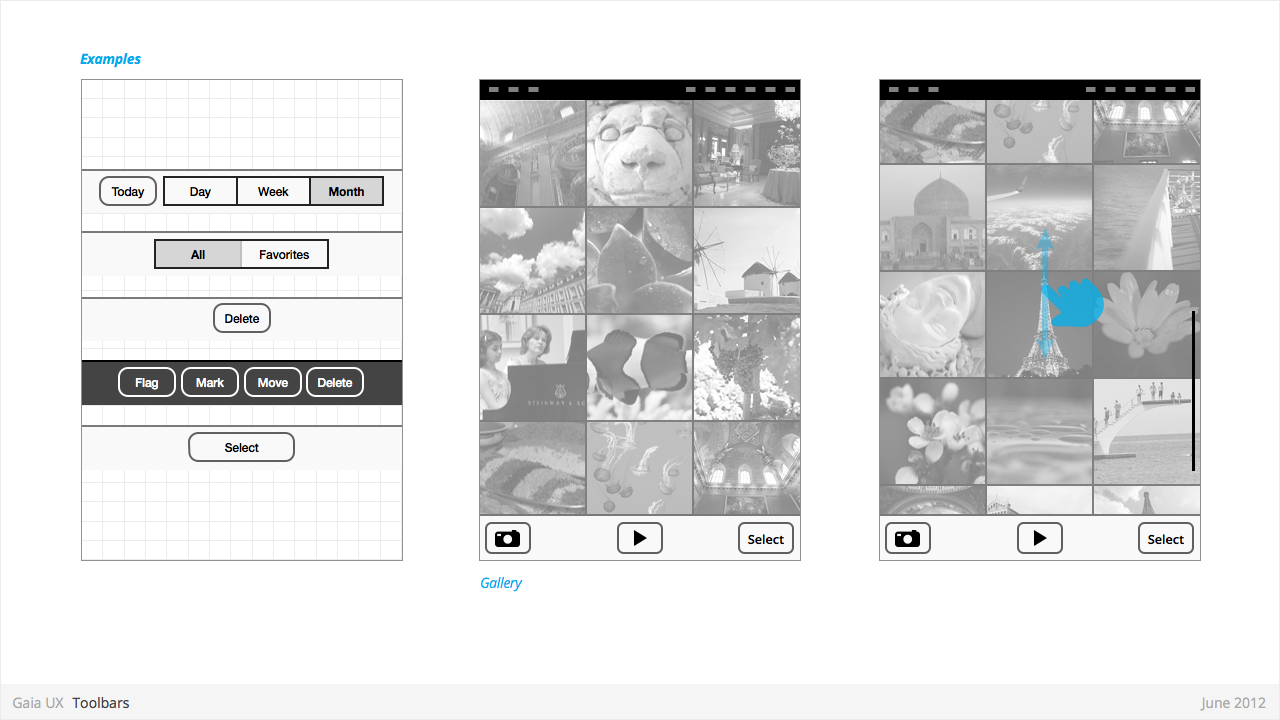
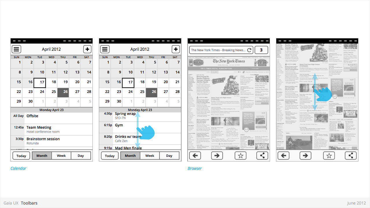
Tool Bars
Used for:
- Contains actions, indicators, and navigation associated with the current view. eg:
- Delete selected items (button)
- Refresh content (button)
- Enter “Edit” mode (filter)
- View “Favorite” contacts only (filter)
Characteristics:
- 100% width. Fixed height.
- Does not scroll with content. Floats above.
- Should be positioned at the bottom of the screen unless Tabs are also present. In that case, should be positioned at the top.
- Can contain various elements (buttons, filters, progress/activity indicators, etc).
